

Pitch Perfect: How to Build a Deck That Gets Your Film Made
DEVELOPMENT

I’ve been putting the final polish on a feature-length script called Empire Motor Lodge and find myself deep in the process of prepping it to ship. The first (un)lucky recipients? Agents and studio execs. If you’ve never dealt with this crowd, here’s a fact: they’re not exactly lining up for the chance to read your screenplay. It doesn’t matter if you’re Denis Villeneuve or a film student in Iowa—many of them, in my experience, simply don’t like to read.
It’s not entirely their fault. They’re buried under a mountain of scripts, and anyone who spends their days wading through that much hippo-dung is bound to get a little jaded. Plus, let’s not forget: film is a visual medium, and most of these readers aren’t writers—they’re watchers!
So, how do we get agents, execs, or even our friends down the street to crack open our screenplay? We build a killer pitch deck.
Buckle up—this is about to get nitty-gritty.
What Is a Pitch Deck
To avoid any confusion, a pitch deck is a concise, visually engaging presentation—typically in PDF form—that outlines the key elements of your film, television show, or whatever project you’re pitching. It’s part business card, part mood board, and part blueprint. A well-crafted deck communicates your story, style, and strategy in a way that’s clear, compelling, and, ideally, irresistible.
Pitch decks can come in many forms, depending on where you are in the process. For our purposes, we’ll focus on the type of deck you’ll send out alongside your script, with the ultimate goal of rallying others to help bring your project to life.
As for length? I’d recommend keeping it under 30 pages. Honestly, 20 or fewer is even better. Your deck tends to tell you how long it wants to be. Listen to your deck.
I’ll reference decks I created for my latest film, Violent Ends (coming in 2025!), and my new screenplay, Empire Motor Lodge. These will serve as our guideposts.

The Violent Ends deck played a major role in securing our financing and casting actors like Billy Magnussen (Game Night), Alexandra Shipp (Barbie), and James Badge Dale (The Departed). Hopefully, the Empire deck does the same.
Here’s my process for building a deck.
1. What and the Whys
If you take a look at the decks I’ve shared, the first thing you’ll probably notice is the vibe. There’s plenty of snazzy images, textures, and design work—but trust me, you don’t want to dive straight into the design process. Start with words on paper. First, you need to answer the “what” and the “why” of your project.
What inspired this story?
Why is it personal to you?
Why does it matter now?
Answering these questions will help shape the visual tone of your entire deck and come into play with some key elements we’ll discuss later on. So, write them down, soak them in, then set them aside—it’s time to focus on the heart of your pitch deck.
It’s what I like to call the LSCTATS.
Just kidding. I don’t call it the LSCTATS. That would be a ridiculous acronym.
Here’s the LSCTATS:
Log line
Synopsis
Call to Action
Tone & Style
2. Log line
Here’s an example of a log line page from the Violent Ends deck. It’s not exactly a traditional log line—it’s more of a thematic premise. This approach works well because it not only hints at the genre but also highlights how the project breaks the mold of what it will inevitably be compared to in the future.
Don’t give them what they expect. Give them what they could have never imagined.

For the Empire deck, I went with a much more traditional log line. That’s because this story is already so non-traditional that I don’t need to show the reader how it breaks genre conventions. Plus, the plot itself is wild enough to serve as its own hook. On the other hand, the hook for Violent Ends is less about the plot and more about its thematic core.
Whether your log line is straightforward or unconventional, the goal is the same: to give the reader a snappy, one- or two-line version of your movie. It’s all about generating excitement. The reader should come away saying, “Whoa. OK, what the hell is this all about?”
3. Synopsis

Here’s a synopsis for Violent Ends. It’s about a page long and gives the reader a fleshed-out sense of the plot. This synopsis is a bit non-traditional. The narrative for Violent Ends is traditional, so to play against that, I focused on drawing the reader into Lucas Frost’s perspective rather than laying out everything he does in the movie. For my taste, traditional synopses often give away too much. Do you want your trailers to spoil everything? I don’t. So why would I want a synopsis to do that?
Now, take a look at this synopsis for Empire:
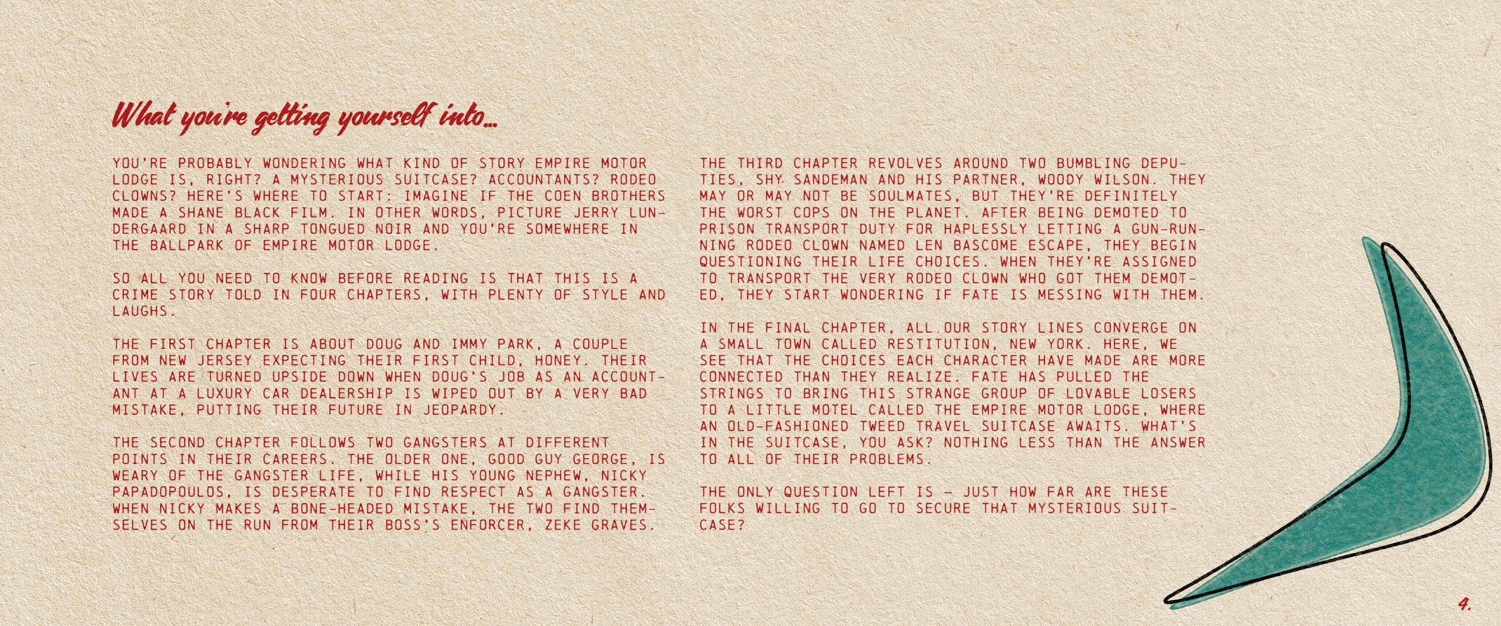
It’s not even called a synopsis, really. As you can see, I’m kind of having a conversation with the reader. There’s barely any plot—and that’s OK. The plot’s not going anywhere; it’ll be waiting for them when they dive into the screenplay. What I’m giving away here is me. I’m giving the reader my voice, and by extension, my vision for this film.
Every page of your deck is pitching you as much as it is pitching the project.
You can absolutely find examples online of more traditional synopses that spell out the plot from A to Z, but that’s just not my cup of tea. If it is your cup of tea, lean into it and make it as exciting as you can. The goal of the synopsis is simple: do whatever you can to hook the reader and start to titillate.
4. Call to Action
The call to action (CTA) can take many forms. It’s often about revisiting the question you answered earlier: “Why now?” or “Why me?” This is your chance to put on your captain’s boots and explain why someone should drop what they’re doing and follow you into battle. How you do that is up to you—there’s no one-size-fits-all approach.
In the Violent Ends deck, the CTA looks like this:
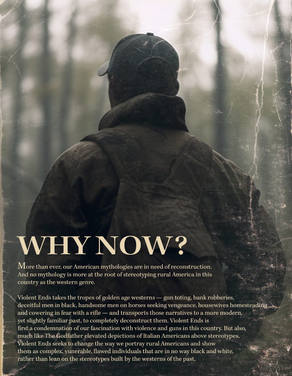
Here, I take a more philosophical and thematic tenor, aiming to explain why this story feels zeitgeisty. That’s a word you’re going to want to know—Hollywood loves it. Many agents, execs, and financiers gravitate toward projects that tap into the current zeitgeist, figuring that if a story resonates with today’s social conversations, it’ll get people talking. It’s not always true, but if you can weave those themes into your project without being heavy-handed, you’ll have a much easier time getting their attention—trust me.
But what if your film isn’t particularly zeitgeisty? No problem! When it doubt, make it personal. Take a look at the call to action from Empire Motor Lodge:


With this CTA, I’ve reached out to the reader, grabbed them by the hand, and shared deeply personal reasons why this story matters to me. One thing is clear with this passage: I’m passionate about this story, and I know it in my bones. That matters.
When you’re passionate — others want to follow.
5. Tone & Style
The tone and style of your film will naturally come through on every page of your deck, but as I mentioned earlier—most readers are first and foremost watchers. They know other movies and think visually. Use the Tone & Style section to draw comparisons to other films while also highlighting how your execution will stand out.
Take a look at the Empire Tone & Style section:

There’s a brief description of the core tone, and then… wait a minute. Empire is the type of movie that would sit down and have a beer with a bunch of other movies? What’s that about? Well, let’s be real—can this movie drink? No. It’s not even born yet, let alone of legal drinking age. But this playfully irreverent tone matches the style of the screenplay and sets the reader’s expectations. I wanted them to feel at ease, like they can sit back, relax, and trust they’re in for a fun ride.
Violent Ends, on the other hand:
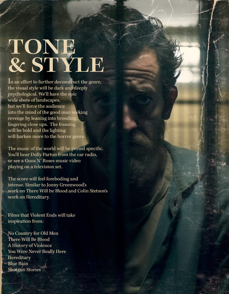
It’s dark. It’s bold. It’s foreboding. I even dive into details like the lighting, shot composition, and the music. All of this works together to paint a more well-rounded and exciting portrait of the film. When they read the script, they’ll visualize it much closer to my creative vision.
Don’t just make the reader see the movie in their head, make them hear, taste and feel it .
Recapping the Wordy Bits
By now, you should have a bite-sized jolt with your log line or premise, something more substantial to chew on with your synopsis, thoroughly hooked us with your reasons for making this film, and given us a clear understanding of what the film will look and feel like.
There will be a few more wordy bits later, but for now, let’s dive into layout and design.
Tools, Tool and More Tools
Before we wade into the deep end of designing, you’re probably wondering what software I used to make these decks. People love to think it’s the tool that makes the art, but don’t get caught up in that thinking. I use a suite of tools from Adobe, which is a subscription service that can get pricey. But here’s the thing: you don’t need Adobe. There are plenty of other options out there.
Here are some popular choices for every part of the process!
Design and Layout Tools
• Canva: User-friendly, drag-and-drop interface for beginners; great for creating polished decks with pre-made templates.
• Keynote (Mac) / PowerPoint (Windows): Versatile tools for creating slides with customizable templates and animations.
• Adobe InDesign: Best for professional-grade layouts and highly customized designs.
Visual Inspiration and Mood Board Creation
• Pinterest: Ideal for gathering visual references and creating mood boards.
• Milanote: A flexible tool for organizing ideas, images, and notes in a visual layout.
• ShotDeck: A curated database of film stills to inspire and communicate your visual style.
Image Editing and Customization
• Adobe Photoshop: Advanced photo editing for creating unique images or mockups.
• Figma: Collaborative design tool for creating custom graphics and layouts.
AI and Concept Art Generation
• Midjourney/DALL-E: Generate high-quality concept art or mood imagery using AI tools.
• RunwayML: AI tools for video and image generation tailored to creative projects.
File Sharing and Presentation
• Google Slides: Cloud-based tool for easy sharing and real-time collaboration.
• Dropbox/WeTransfer: For securely sharing large deck files with collaborators.
Professional Templates
• Envato Elements: Access to a library of pitch deck templates and graphic assets.
• TemplateMonster: Offers ready-made pitch deck designs for PowerPoint and Keynote.
If you are wondering what I use, here’s my process:
I use Shotdeck to source stills from movies that are similar to mine, and Midjourney to generate AI images of my world and characters. Then, I cheat a bit—I use my degree in graphic design and studio art to paint and touch up those characters with an Apple Pencil on an iPad Pro using Procreate. Next, I move to Photoshop to add the words, textures, and detailed layouts for each page, and finally, I bring everything into Adobe InDesign to configure the PDF exactly how I want it. When it’s ready, I share the final PDF via Dropbox.
Don’t get overwhelmed—this is just my process, and yes, it involves a lot of software. For those who aren’t technically inclined, it can feel daunting, but let me repeat: don’t get caught up in software worship.
Find the simplest path forward for you and work at your own pace. Some of these platforms alone will let you do all the things I do in five different programs. And don’t get frustrated if you’re feeling challenged. You’re not going to find your design voice overnight, and that’s OK. Also, YouTube is your friend—there are tons of resources out there to help you get up and running on any of these platforms.
OK, I’m going to leave the softwares to you. As for design choices, here’s where I start:
6. Cover Page & Choosing Your Format
Your cover page is one of the most important parts of your entire deck. If the deck is like a trailer, the cover page is your one sheet. Its job is to grab attention and make us want to dive into the pages inside.
My advice for designing a cover page: think like a poster designer. Look at films in your genre—what do their one sheets look like? If it’s a comedy, for example, yellow has a proven track record. Seriously, check out this video:
Is it a neo-revenge western psychological thriller? Then it might look something like this:

This brings us to format. You have two choices when it comes to format: landscape or portrait. In other words, upways or sideways.
Violent Ends is portrait, Empire is landscape:

For Violent Ends, I chose a portrait orientation because it’s a more novelistic, character-driven film. I knew portraits of faces would feature heavily, so this format complemented the creative.
For Empire, I went with a landscape orientation because the film will be shot with anamorphic lenses and often feature multiple characters in a single frame. Since it’s a big ensemble with comedic elements, the landscape format felt like the right fit for the project. Blocking comedies is for another day.
With format, the choice is yours.

Don’t stress. This isn’t Last Crusade.
7. Aesthetic
Don’t ask me what your aesthetic should be. Go back to your “what” and “whys,” your premise, your synopsis, and your tone page. Think about the music and visuals of your film—your answer lies somewhere in there.
For Violent Ends, the aesthetic is gritty, with torn, creased, and stained pages. Empire, on the other hand, uses pops of bright colors and a mid-century vibe that ties into a key location in the film. Mine your script for a location, a period, a color scheme, or whatever you can find to be your launching off point for aesthetic. All great design—whether it’s graphic, software, or even automobile design—starts with a great story.
Caveat: My style clearly has a lot going on. Yours doesn’t have to. Art does not have to be complex to be good. Simplicity is clean, and clean is clear. That sounds like a legit quote, right? Did I just make that up? Go ahead—quote me on it.
Simplicity is clean, and clean is clear.
If you’re first starting out, keep it simple and clean and clear.
8. Imagery
As I mentioned earlier, creating eye-catching images for your deck is hugely important. You want your visuals to grab attention and pop at first glance.
Here are some great places to source imagery:
Free Stock Image Websites
1. Unsplash
• A curated collection of high-quality, free-to-use images contributed by photographers worldwide.
2. Pexels
• Free stock images and videos with a wide range of themes and styles.
3. Pixabay
• Over 2 million free stock photos, videos, and illustrations for personal or commercial use.
4. Burst
• Free stock images provided by Shopify, ideal for business or creative projects.
Paid Stock Image Websites
5. Shutterstock
• Extensive collection of professional-grade stock images, videos, and music.
6. Getty Images
• High-quality, editorial, and commercial images—ideal for more premium presentations.
7. Adobe Stock
• A robust collection of royalty-free images integrated with Adobe Creative Cloud.
• Affordable royalty-free images with flexible subscription options.
Artistic and Conceptual Resources
9. ShotDeck
• A database of film stills for reference or inspiration, perfect for filmmakers building mood boards.
10. Artgrid
• High-quality video stock footage with cinematic appeal, often paired with creative photography.
Creative Commons and Public Domain
• User-uploaded images with varying licenses. Be sure to check attribution requirements.
12. New Old Stock
• Free vintage photos from public archives, ideal for historical or nostalgic projects.
• A collection of public domain images from the Smithsonian’s archives.
AI-Generated Visuals
14. DALL-E
• Create customized, high-quality images tailored to your exact needs.
15. MidJourney
• Generate artistic, conceptual images through AI prompts.
Niche Resources
16. Morguefile
• Free photos for creatives and professionals to remix or adapt for projects.
17. Stocksy
• Artist-owned cooperative offering unique, high-quality, and exclusive stock photography.
Custom Image Creation
18. Canva
• Create custom visuals using a library of stock images integrated into the design tool.
19. Figma
• Great for combining sourced images with custom graphic elements.
These platforms provide everything from free options to premium, niche, or highly tailored image collections to elevate your pitch deck’s visual impact.
9. Layout
I could write an entire piece on layout—it’s truly at the heart of all visual arts. There are countless resources out there on the subject, but here’s my advice: start your layout process by sketching ideas on paper before even thinking about turning on your computer. Begin broad and free, letting your ideas flow, and then refine and get more precise as you move through the design process.
I like how this architect starts his design ideas:
There are also myriad Youtube videos out there that can get you started on composition. Here’s one from a bubbly girl that starts with a sea-pigeon pooping!
Now get designing.
A Few More Optional Pages to Consider
As you flesh out your deck, there are a few additional pages you might want to consider including. I put all of these in the (semi) optional category:
10. Characters
It can be helpful to introduce the key characters in your film and explain why they’re worth watching. Duh. This can get readers excited and give them a sense of the story’s tone and depth.
Take a look at the character pages in the Empire deck. That film is packed with colorful characters, so the deck benefits from letting the reader get acquainted with its kooky faces. The only reason I don’t have character pages in the Violent Ends deck is because the style of synopsis I chose did most of the character build up for me.
11. Key Attachments
If you have actors attached, create an attachment page with their headshots and the names of the characters they’ll play. Even if the actors aren’t A-listers or even B-listers or C-listers, seeing their faces can really help the reader visualize your story.
If you don’t have attachments yet, don’t worry—that’s what the deck is for!
12. Crew Attachments (semi-optional)
You might want to showcase the creative team or production companies attached to your project. Highlight their experience and credits, but keep it focused. I’d say this is “semi-optional” because, at the very least, your deck should absolutely include a page introducing you as a filmmaker. If you’re a first-timer, share your creative background or relevant experiences—it’s very important that we get to know you.
For key crew, limit it to these roles:
Director or Writer/Director
Writer
Executive Producer (if a well-known name that adds flash)
Producers
Director of Photography
Editor
Production Designer
Casting Director
Composer
Costume Designer
No more—and honestly, less is better. Let the experience of the attachments guide you. For instance, I wouldn’t always put Executive Producers, but I just built a deck for a movie we’re making that has Todd Field attached as an Executive Producer — obviously you want people to know if someone of that calibar is on board.
Check out the Empire deck for an example of a simple crew attachment section.
13. Numbers & Strategy
There may be a need for you to present your deck to a financier or someone who you want moolah from. Happens all the time. If so, you’ll want to have some sort of analytics page, or more, that describes the following:
Budget: A rough range (e.g., $1M-$3M) to give a sense of scale.
Production Schedule: When and where do you plan on shooting and how many days do you plan principal photography to be?
Distribution Strategy: Are you aiming for festivals? Streaming? Limited theatrical?
Audience: Who is your core demographic, and why will they love this movie?
Pro Tip: Avoid overly technical slides. Producers and investors want clarity, not complexity.
14. Pizzaz
These are straight pizzaz. If you like pizzaz, great! If you don’t, no worries. Sometimes I like to pop in little quotes that give thematic context. Like here:
That’s not even a real quote. I made it up. You know what else it is? Good pizzaz. In the Empire deck, I asked my friends who read the script to give me a one-line quote I could use in the deck (if they liked the script of course, don’t add bad reviews). This is how it turned out:

Again, it’s all about getting the reader excited about you and reading. Pizazz!
15. The End and Thank You
Sometimes I put a final page at the very end of the deck that literally just says “Thank You!” That’s it. It’s very simple and it’s a way of showing the reader you appreciate the time they’re taking to consider your project.
Pro Tip: Consider ending with your call to action! This can also be a way to push the reader off toward your screenplay with a huge emotional kick in the butt.
In Conclusion
Creating a pitch deck that gets your project made is as much an art as it is a craft. It’s about striking the perfect balance between presenting your story clearly and showcasing your creative voice. At its core, a pitch deck is a tool—a means to ignite excitement, build trust, and convince someone to take the next step with you on this journey.
Remember, your deck doesn’t need to be flashy or perfect. It just needs to feel authentic to your story and to you as a filmmaker. Start with the foundation—your “what” and “whys,” your log line, synopsis, and tone—and let the visuals, design, and structure flow naturally from there. Don’t get caught up in software worship or overly complex layouts. Simplicity and clarity will always win.
Most importantly, trust your instincts and let your story lead the way. The goal is to create a deck that excites, inspires, and leaves readers eager to dive into your screenplay.
So, whether you’re sketching out ideas on paper, tweaking designs in Photoshop, or brainstorming that perfect log line, keep pushing forward. The next green light might be just one killer pitch deck away.
Good luck, and happy pitching!

This was so helpful! Thank you! And super generous of you to share your actual work
Great Resource and a definitive digital guide from writing pitch decks. Thanks for sharing!!!!!